Looking at new ways to move the company forward, Supacolor wanted to launch a mock-up tool to make the process of ordering prints efficient. The brief was to bring in ways for user to experience what their prints would look like.
My Role
Lead UX designer through end to end process: discovery, user research, requirements, design, testing, support through launch.
Softwares
Figma | Illustrator
Supacolor are the industry leader in high quality heat-transfer printing. Supacolor are trustworthy, high quality, slick, sharp, intuitive and responsive.
Part of the brand promise is being ‘Supaeasy’ and this needs to be reflected in the website UX / UI.
Goals
To create a design tool that the user can use to visualise the prints. Remove all intimidation and difficulty. Inspire users by showing the ease of ordering transfers.
1. Discovery
Meet Jess
Professional garment decorators: Screen Printers / Embroidery / DTG / Brands – Intermediaries and wholesalers need a reliable heat-transfer supplier, with a quick turnaround and low minimum order number.
Persona:Hemi’s ecommerce store allows people to choose a templated or custom design, and their choice of fabric- and he’ll print and deliver the completed order. It’s peak sports season, and his team are sending out 5,000 units per week across the United States.
Crafters / Designers / Hobbyists – Up and coming side hustlers, who need heat-transfers that bring their designs to life, with quality and durability they can be proud of.
Persona:Luke’s been inspired to start his own New Zealand streetwear company, selling his work through Instagram and at local markets. He needs an affordable and easy way to print small batches of his designs on a variety of materials.
Marketers / Businesses not in garment decorating but looking to add merchandise: Influencers, coffee shops, restaurants, bars, motorcycle clubs, etc. Established retailers who need a trusted quality heat-transfer supplier, with quick turnarounds to keep up with stock resupplies.
Persona: Ava’s Instagram based eco-friendly sportswear company sells a range of clothing and accessories across the United States and the United Kingdom, at 800 units per week. She needs a trusted heat-transfer supplier to provide premium results that stand up to her customers’ expectations.
Current state
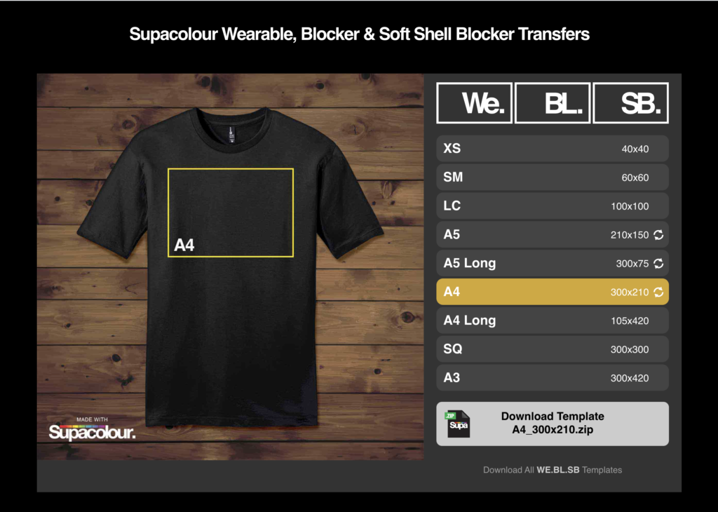
Currently the user can just click on different sizes and download the templates
User Research
How do we want the user to feel?
Excited and empowered and feeling the power of positivity
Emotionally connected
Compelled to purchase
They are using the best quality in the industry
Sense that they have all the information they need to get to the next step e.g. print, design, order press
Wanting to return and do the process all over again
We aren’t just selling transfers, we are selling the experience, the journey and the destination.
2. Define
User Journey
Next I start to map out the user journey. This provides a great insight into the steps that the website should have. It’s handy to do this before wireframing because you can start understanding what it is that the website should do and how the user is likely to use it. I also map out the users emotions to understand how the user may feel at each point of the journey.
3. Ideation
Now that I have the user journey complete, I can now start to think about how the app can function for the user.
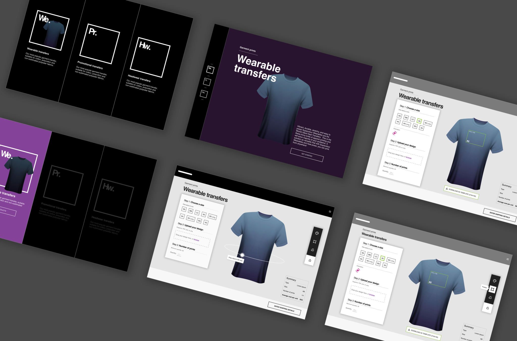
First I wireframed some of the components, looking at individual atoms and molecules.
4. Prototype
Personalised Experience
When thinking about layout, I wanted the customisable options to be clear and easy to use and take prime position on the page. I have tried to create hierarchy by keeping the required options to the left in white and mockup-specific options (that’ll be used just for visualisation) to the right in black.
5. UI
Time To Design!
This just shows the mock-up tool which will be the prime focus of their new website.